Crafting A Unique User Experience for A Boxing and MMA Online Retailer
Project Overview
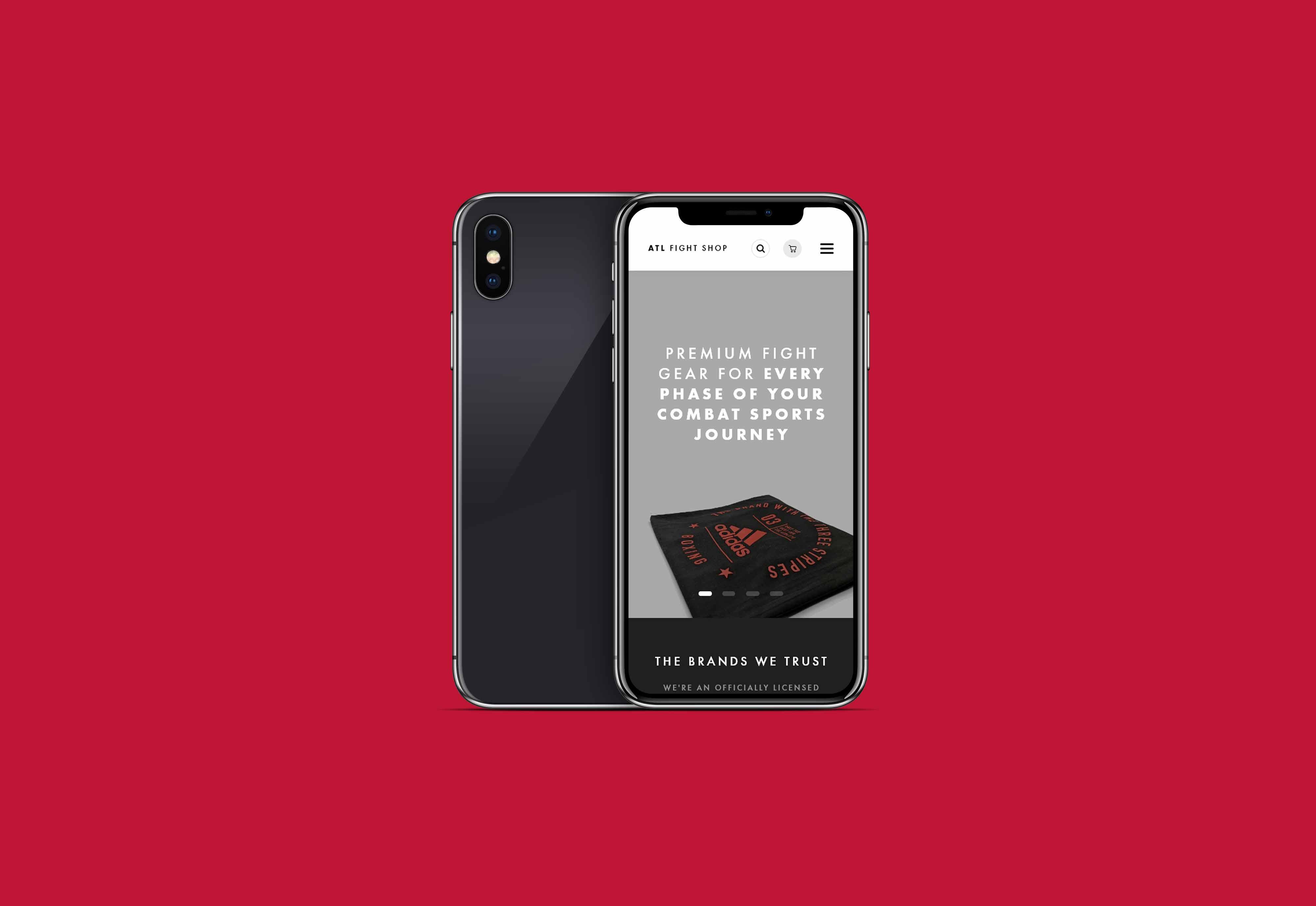
ATL Fight Shop is an online retailer selling products in the boxing and mixed martial arts industry. from boxing gloves to Brazilian Jiu Jitsu gear. Because of the heavy online competition and saturation of the market, it was my job to design a unique shopping experience that makes ATL Fight Shop stand out from the rest of the online retailers. I was also respnsible for managing and collaborating with engineers during the production of the new store.

What's The Product?
ATL Fight Shop is an e-commerce store on the popular platform Shopify. The store was using a generic theme purchased from one of the popular creative marketplaces, but it was determined that a custom theme development was necessary in order to make the major changes the store needed in order to stand out.
Who's The User?
ATL Fight Shop's primary target audience are men between the ages of 20 - 35. They are very particular in the type of gear they carry in their gym bag and have been dedicated to combat sports training for more than a year. They prioritize customer support and speed of delivery.
What's The Goal?
The ultimate goal for ATL Fight Shop is to make sales, but also to begin to develop a promising customer base who value the forward-thinking approach the store was taking.

The Process
When I began working on the ATL Fight Shop project, it was made clear to me that the store was to be perceived as "different" and "forward-thinking". At the same time, I needed to ensure that we deliver a positive and seamless user experience in order to maximize conversions.
During the ideation phase, two inital ideas I came up with and moved forward with were:
- 3D Product Viewer (Fully interactive)
- Accepting popular cryptocurrency during checkout
With the 3D Product Viewer, we allow users to interact with a virtual version of their preferred boxing gloves and training gear. During competitive analysis, we noticed that this was a feature that was not widely available from even the biggest names in combat sports. After a short research sprint, I was able to find a vendor who could produce the 3D products and allowed us to implement the 3D experience via HTML iFrames.
With Cryptocurrency, this allowed us to demonstrate to a younger audience that the company was indeed heading towards a forward-thinking future, and made it seem like a company you would want to keep doing business with. During interviews with prospective users, we discovered it definitely raised the perception of the store in a positive light. Luckily, we were able to offer this service to users thanks to Shopify's Coinbase Commerce integration, which allowed us to generate an API key and quickly pase into Shopify's payment processing optipons in the store settings.
The Sitemap
The sitemap for ATL Fight Shop needed to be simple and to the point. I decided to use three top-level navigation items: Gear, Blog and Contact, with an Account Sign-In option at the end. See the sitemap below for further details about nested pages. Use the + and - buttons in the embedded diagram below
The User Flow
The user flows for the new ATL Fight Shop site needed to follow a straightforward process. The diagram below demonstrates how users land on the store and how they get from the home page to the order confirmation page.
The Wireframes
Once I have the sitemap and the user flows mapped out, I then begin to sketch ideas for the new home page, collection page and product page. In the images below, the numbers represent the order in which the wireframe flows from top to bottom.
Home Page
For the home page, I wanted to focus on showcasing the variety of products available, as well as highlight the different brands the store offered to users. Further down the page, I implemented a module that highlighted the product categories as well as a notice to users that the store indeed accepts cryptocurrencies (since this won't be a main talking point for users, this was further down the page).

Collection Page
The Collection Page template provides a filter/sort section for users in case they want to rearrange the products shown based on their preferences. Then, a set number of products get populated and below the last set of products is a left/right arrow button to indicate whether or not there are more products to be viewed within a specified collection.

Product Page
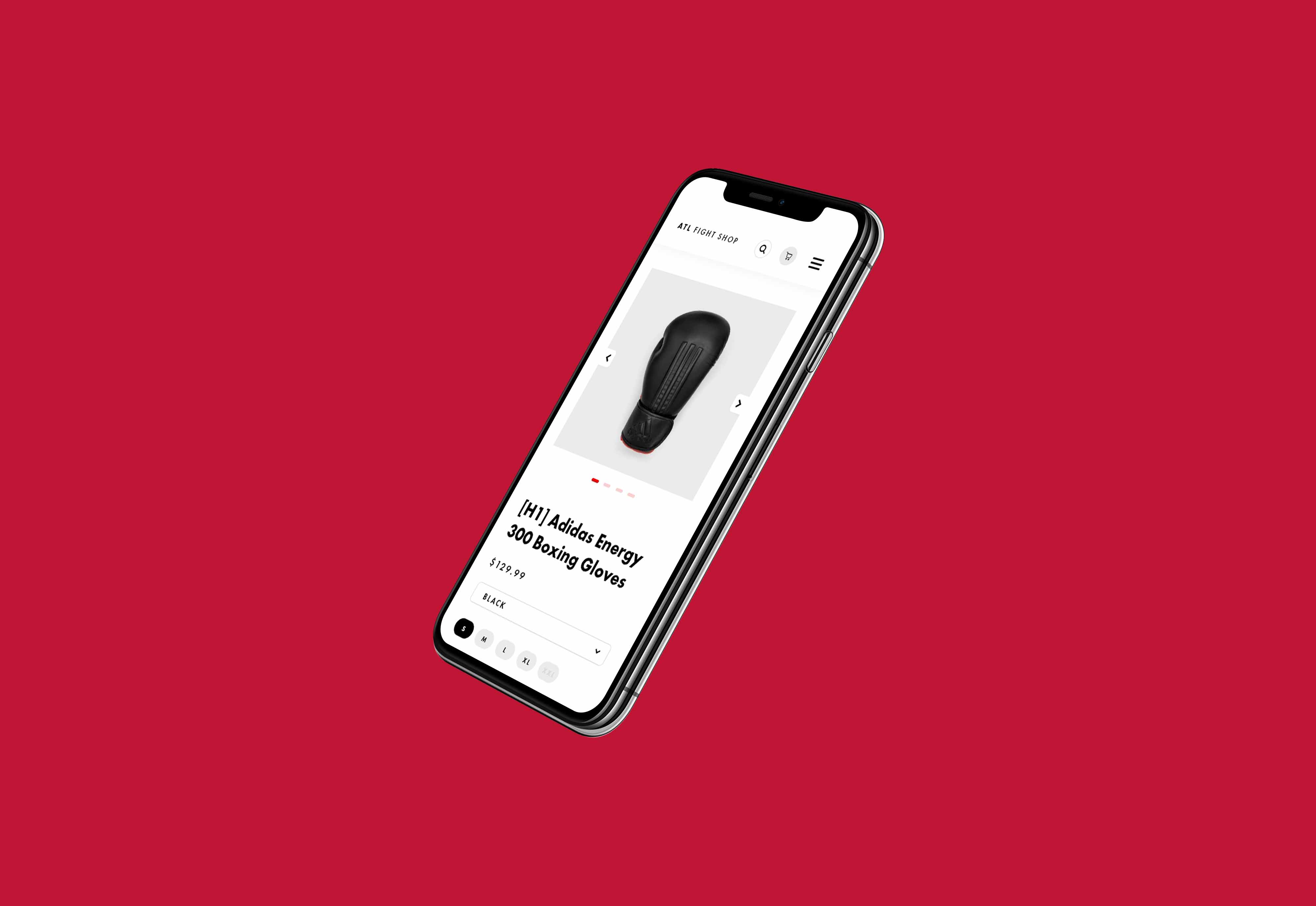
The product page template puts the product front and center with a large image with rounded-cornered rectangles indicating the image count. Further down the page will be the product details section, followed by the 3D viewer option. Since those section are key to our detailed user flow above, they needed to be towards the top of the page.

The Hi-Fi Prototype
Explore Desktop Prototype Explore Mobile PrototypeProject Details
Client: Atlanta Fight Shop, LLC
Duration: 4 Months
Role: Sole UX/UI Designer, Production Manager
Project Type: End-to-end responsive website & branding
Let's Work Together
No matter how large or miniscule your next project is, if there’s any way that I can be of assistance, I would love to chat. Click the button below and fill out the form on the next page to get in touch!
Get In Touch
